Inspiring Magazine Designs
 I loveeeee this cover because of the color scheme and the very 90s vibe. I also like how Lauryn Hill is covering part of the rolling stone logo, but you can still tell its rolling stone.
  This cover is so amazing because of the symmetry of beyonces body(her legs and then the extension of her dress on the left side.) I really like the contrasting white and red and how the flower hat is covering part of the Vogue title as well.
  \
\I really like this spread because of the super engaging photo and then the contrasting red. The bold font mixed in with different text is also super interesting.
 This spread is also super interesting because of the grunge nature of it. I love the assymetrical, rotated text and the intense amount of grain and contrast. It fits the movie really well.
I love how this ad is a fine art picture in itself. The use of muted tones makes it feel very antique, but the modern text contrasts against it. I also really like the use of a camera in front of the image. Its an image of someone taking photo. Love it
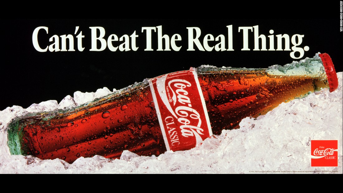 I love this coca cola classic ad. It was made recently to celebrate 130 years of Coca Cola, but it looks very old and vintage. I love how real the ice and soda looks and the bubbles in the glass are satisfying.


Comments
Post a Comment